Helpful online; heroic in real life
TEXAS CHILDREN’S HOSPITAL
THE CHALLENGE
Understand why visitors use texaschildrens.org and design a website that’s as much of a world-class experience as the hospital it supports.
Texas Children’s Hospital was one of the top-rated pediatric hospitals in the United States but their website had been updated only once in almost a decade. Patients and physicians agreed that the vast amount of important information was difficult to find.
THE SOLUTION
We scheduled interviews with the chiefs of every department to understand what they wanted in a website for their patients and their patients’ caregivers.
We sat and talked to Moms, Dads and kids. We learned that patient caregivers are heroes.
We navigated the same 18 miles of hallways checking off a list of departments on a mock appointment calendar. We learned a lot.
The most important thing we learned was that the website was where caregivers were going for information about whether their child was going to be okay, and they couldn’t find the information they needed.
Everything was there — they just couldn’t find it.
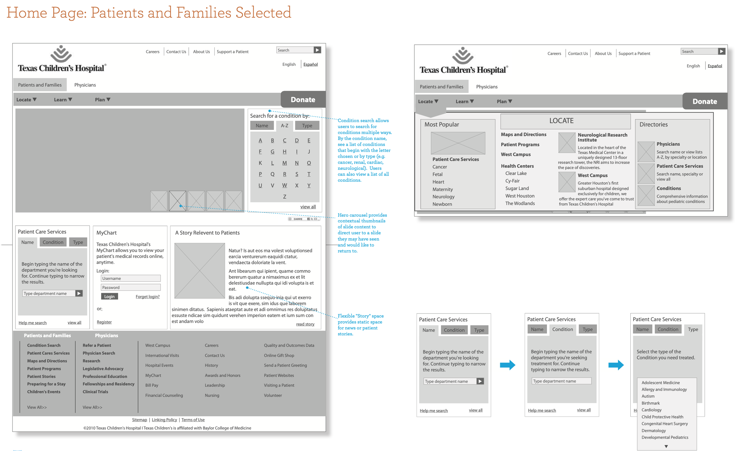
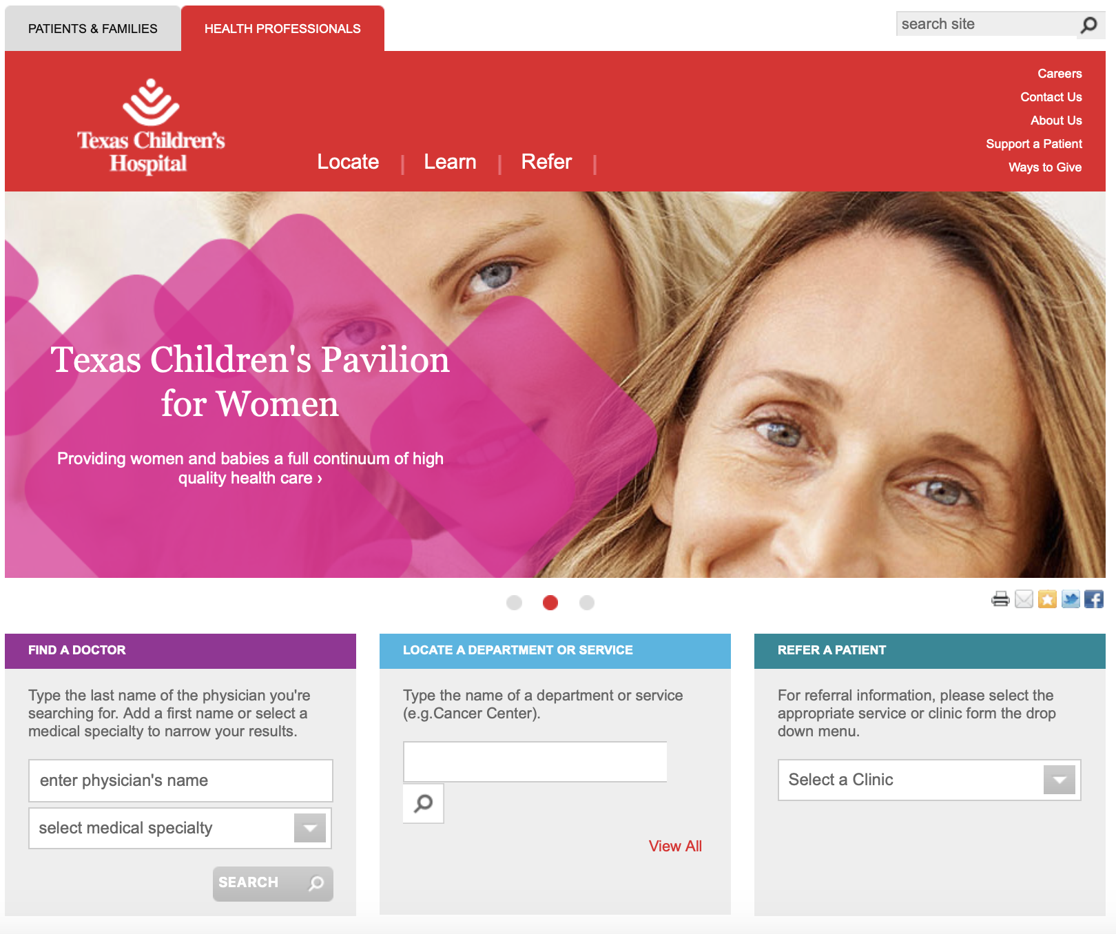
We designed an information architecture that surfaced unique information for physicians and caregivers. We stripped away everything but what visitors needed the most.
In addition to introducing simple search elements that allowed caregivers to find doctors and departments,
we simplified the navigation and created landing pages for the top sections of information. We also added mega menus for each section.


Go back to work


